MENNO VON BRUCKEN FOCK
RODNEY MATTHEWS, illustrator

Rodney, you have already celebrated your 40th anniversary as an artist?
"To tell you the truth: I feel like it’s actually closer to sixty, because I started very young. I’m 64 now and I was inspired by my father. He was one of those multi-talented men. He did everything from engineering to house building, ambulance work, boxing, you name it. He was a drummer in a dance band as well. One of his many talents was art. Although he wasn’t trained as an artist, never went to art college or anything similar, he did pictures of the local church, cottages and so on. At home I grew up with his art, hanging on the walls. I don’t think many people know this. At the time we were living in just an ordinary council house with thick white, creamy wall paper on the walls. One day he came home in his overalls, because he had been busy building and with a carpenters pencil in his pocket and in a moment of utter spontaneity he started drawing all kinds of Disney characters, like Mickey Mouse on the walls at child’s height. As a child I was just getting interested in cartoons and I was caught in a spell that day, my first real excitement in art. Since then Walt Disney became one of my heroes. I really don’t know what my mother must have thought, because wall paper in a home is sort of sacred and I don’t think she would have appreciated her kids drawing on the walls at all! It encouraged me to start drawing on ordinary paper the same Disney characters, and that’s how it all began! At school I put all my interest in the art lessons; I didn’t like the English lessons or math at all, so it was art all the way."
 Have you any idea how many artworks you have produced in all those years?
"Yes, I have. I estimate that I’ve done about five hundred colour pieces and many thousands of pencil drawings. If you start working on computer games, you end up with a pile of sketches, about an inch thick. I’ve done three of those so you can imagine how many drawings must have been in there. I think close to a thousand pencil drawings for those three games alone. For each colour piece there are several sketches first. What I do is use tracing paper and start drawing, put another piece of tracing paper on top of that and improve what I didn’t like in the first drawing and so on. If the definitive drawing happens to be drawn on a fairly small piece of paper I use a projector to blow it up. For a record cover for example, I needed at least twice the LP size, so that meant another drawing as well. When I was younger I did water colours of animals, birds and so on. Some of those I’ve sold to relatives and friends. I’ve only done two oil paintings in my life, one of them I did because a kid at school challenged me to a contest for which I did my drawing of the Cutty Sark, the famous clipper. If you include the cartoony stuff like the series of gas bags, we’re probably talking about another one hundred colour pieces or so and hundreds of pencil sketches."
Can you explain the basic principals of the technique you use?
"Once I have the final sketch ready, I put it in my projector and blow it up until it has the definitive working size. Then I put it down on a piece of art board and using what they call tracing down paper. I draw around the defining lines of the picture and then I start painting. The advantage of using tracing paper is you end up with a nice clear finished drawing and you could throw away all your previous attempts. This in opposite to people who keep on scrubbing on pieces of cartridge paper, start erasing and fiddle about with rubbers. They end up with a kind of crummy drawing. A second reason why I use tracing paper is that I’ve got a problem with my vision. I have a ‘slant’, meaning if I start drawing a circle, I end up with a sort of an oval with the points from bottom left to top right. A straight line would have a tendency to lean towards the right. No matter how hard I try, these deviations are inevitable. So what I do is turn the tracing paper around and then I can see how much exaggeration there is. It costs me extra time but eventually I accomplish what I want. When I turned fifty, I went to see an optician for my first pair of glasses. They saw some abnormalities in my left eye and I was referred to an eye-specialist. He saw scars in the back of the eye and asked me if I had been involved in some sort of trauma. At first I thought he was talking about things like the loss of my mother, but he meant traumas like an explosion. Then I remembered a self-made gun blowing up in my face. I used to make my own bullets with chunks of led and black powder I got from a friend at the pistol club. I used to make all sorts of self-made guns using pieces of heating pipes. Once I used too much powder and the thing detonated right in my face, blowing little pieces of burning gunpowder in my face and eyelids. Most importantly it was a blow that hit me in the eye and this specialist thinks this accident might be the cause of this problem. Funny thing was this specialist had encountered a similar sort of accident."
You didn’t notice any changes in vision after this event? 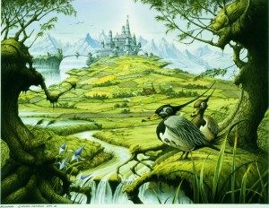
"Not really. I wasn’t working commercially in those days so I don’t think either me or anyone else would have noticed any slight irregularities. It might have become worse over the years."
So now you start to put colours on your white art board?
"That’s right. The art board has a very smooth surface and I rub the pencil lines down so you can barely see them anymore. To avoid showing through the ink I start to put in the colours. This I do gradually, building it up in layers, because it’s pretty difficult to go back once you put up a colour, it’s better to keep on adding until you think it’s okay. Most of the white in my artworks is the actual colour of the board itself. I only use white with an airbrush to paint skies and mists."
Compared to the seventies, what are the changes in technique and/or tools if any?
"Actually very little because I’ve stuck to this technique throughout the years. There were of course some improvements of the material such as the ink. The current inks are much more fade resistant than in the early days of my career. Nevertheless I always advise my customers to use anti-fade glass. However, a current problem these day is that you can’t get hold of the same type of art board I used to use, because of the fact that manufacturers stop making them. Younger artists do their art using computers and so the demand for boards has practically come down to none. The only kind of boards I can get nowadays are the water colour boards. Only the hot pressed water colour boards have a fairly smooth surface and those are the only ones I can use, but still I can’t get the same degree of accuracy compared to the old fashioned boards. There’s still some texture in this paper and it absorbs much more readily. As soon as you touch this paper with a brush, that’s it! It’s there to stay while with the old fashioned boards you were able to manipulate the colour fairly well until it had dried. Another thing is those water colour boards don’t come in sizes as big as the other ones. So you won’t see me making artworks in the size of the Michael Moorcock posters anymore. It means my printed artworks are smaller as well because I don’t like to blow up the original to a bigger size. The giclee prints are all artwork size or smaller. While kids wanted to buy huge posters in the seventies, it seems nowadays there is a tendency to buy smaller pieces of artwork."
You’re using a special masque while you work?
"Yes, at present I do. My son Yendor always reminds me to put it on. I didn’t use to wear one in the old days, though. I remember my father busy welding with only some eye protection, sawing pieces of asbestos and always working in an environment full of dust and still he lived to be 74! So being around my father a lot and not working with a mask at first I should say I’ve inhaled my fair share of crap, but it’s never too late so I stopped working without a mask on."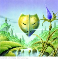
In the seventies and the first years of the eighties you were very famous as designer for record covers. In the past few years your artworks again featured some albums on Frontiers Records by Allen/Lande, Magnum and Bob Catley. You also did covers for other acts like the Jeff Scheetz Band. Were there others as well?
"Yes, I did work for the Temple Dogs and V-rats too. A lot of bands have asked me for ‘second rights’ to use my images for their album covers, about four to five per year on an average. Many bands don’t have the means for a commission and so these second rights are the next best thing and if they give me an album title and a music genre I usually can come up with a decent band logo and title matching the cover. In the series of classic rock legends some my artworks have been used for Uriah Heep and Hawkwind DVD's for example. There's also an Irish band called Stormzone, who licensed things."
Can you tell me something about the commissioned artworks? Are they your ideas or theirs?
"Most of the people come to me because they know my work and they are happy to give me the responsibility based on genre and album title, but sometimes they give me a demo as well. The other category like for example Tony Clarkin of Magnum always comes to me with a well-defined idea, scribbled on a beer mat or something similar but he knows exactly what he wants and explains it to me very clearly. In the case of Into The Valley Of The Moon King he wanted a 'Mozes meets Leonardo Da Vinci' like character with in front of him a sort of scruffy schoolboy whom he invites to go on a venture, pointing to a doorway where you can see a distant moon. It had to be circular and he wanted a tiger and a dragon in there as well, sort of confronting each other. Everything else, like the city of the Chase The Dragon album was my own input. One of the reasons I put that city in, is that when Tony Clarkin came to me for his first commission, the original title of the album later known as Chase The Dragon, was The Spirit, so this city represented a spiritual entity with no beginning and no end unlike the earth. On the moon I projected part of the logo from Chase the Dragon, like an 'M'. The two mice were on the Sleepwalking album, but also in their previous studio albums Princess Alice and The Broken Arrow and On A Storyteller's Night. Then there's a bag with some stardust coming out from the cover of On A Storyteller's Night as well as the stick on the floor so you might get the impression that this Mozes-like character is in fact the storyteller, because you only see his back on that cover."
A number of years ago you moved from the beautiful and warmer Somerset to the rugged Wales. When and why was that?
"I like to think that Karin and me, both being artists, wanted to move to a place more peaceful and quiet to get on with our work. Besides, the landscape in Wales with all those trees, hill's plants and creatures, gives a lot of inspiration for a fantasy artist like myself. Fantasy art needs to be fed by something realistic. I feel fantasy art can only be convincing if there are elements of the real world in it. All the creatures I've created are based on real animals, not because I've been on dope what a lot of people might think! The other reason was that we wanted a place that allows us to be more untied, so that we could leave half finished artworks, inks and all sort of stuff artists use, lying about without having to bother. So, Karin came up with this Country Life magazine one day with this place in it for an affordable price. We checked it out and although there was some resistance on my part, being able to play the drums as loudly as I would want to and seeing those mountains, I thought, yeah I can handle this."
A number of years ago you published two portfolios and several books. I believe that all items are out of print and may be considered collector’s items. Do you have any plans of reprinting any of them or maybe publish a sort of an overview?
"Well, a few years ago there was an attempt for a Best Of Matthews book, but the publisher who showed interest subsequently disappeared. That book would have been an offshoot from Dragon's World/ Paper Tiger. The next thing I did, was to draw out a book plan and lay out the pages of a Matthews Sketch Book, that would have included all my sketches designed for computer games. So a sort of 'work in progress' type of book for students. That didn't happen because I didn't get a publisher interested. More recently there has been interest from Denmark to publish a fourth anthology plus extras such as the addition of better known images and a number of logos I've done since my last book Countdown To Millennium."
He did a Patrick Woodroffe book but the financial crisis has put all things on hold for the moment. It's really a shame because putting stuff on one's website is not the same as having a nice book in your hands. I'm sure there will be a sort of revival one day, because this kind of art just does not die away, but the interest might not be big enough to get a publisher interested to risk his money.
After those glorious years of having success with album covers, logos, posters, calendars and doing illustrations for books, you’ve tried to explore other paths. You have been involved in a TV series and computer games? How well did these new things work out? 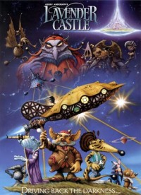
"All these worked out great from a creative point of view, because at last I could see my images move! You see, I've always had a pretty good idea of what my creatures, warriors and you name them look like at the reverse or over the horizon, although mostly you only see the front. These computer games gave me an opportunity to show people what's on the other side as well. The other satisfying thing about this is that it gave me the opportunity to work with other creative and talented people. It prevents you from repetition and from a sort of fatigue that might come over you if you work alone most of the time. Working in such a team for me was often much more rewarding and it meant a lesser burden on my shoulders as well. Furthermore it was a learning process for me too. The limitations of the number of pixels and things I never thought of forced me to compromise my works to be able to meet their demands. For Lavender Castle I've had the pleasure of working with Gerry Anderson, a great guy who gave me artistic freedom to the full, even if it meant telling people they didn't do their jobs good enough! The castle itself is a benevolent power that is there but just out of reach. Of course you have the villain and the heroes, but my heroes were more like the David against Goliath, not the heavily armed troopers. Stories like Peter Pan or Snow White And The Seven Dwarfs are all stories that seem to tap in this almost universal timeless thing that mankind has always had and that leads them to something else that is better than where they stand. You could call it escapism, I would rather call it 'belief'. Another project I did some work for was the movie The Magic Roundabout in conjunction with old friends from Bristol: Bolex an animation company. There I worked with the very talented Dave Borthwick, an amazing animator who won a lot of rewards for his work. I got the request to design something a bit more edgy which I did, because Bolex wanted something less juvenile, but in the end the editing French company decided most of my stuff was 'too heavy', so a lot of it was never used. I really would enjoy working more on 3-D stuff, because that's where my heart lies. I enjoyed Disney as a kid and there's so much more satisfaction to help create an animation than there is on a 2-D record cover design."
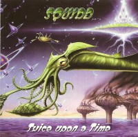
A few years ago you released an EP with interesting progressive music by Squidd. Can you tell us something about this band and about the extraordinary drum kit you used back then. What happened to this band? There are no more recordings?
"I don't think there are more complete recordings. The only thing I have left is a bunch of scrappy old cassette tapes from rehearsals. I'd like to get the band together again and re-record those but you know how these things go. The lads are scattered all around: one in London, two in Bristol, me up here and our soundman, John Waterhouse, nicknamed The Boffin, who put these tracks on CD, passed away recently. These tapes were from two sources: one from a TV show we did back in 1972, I think it was for the BBC, the other two tracks were recordings from some radio show in Bristol. Shortly after those recordings (in Christchurch Studios) we disbanded, and everyone forgot about those recordings. A few years ago Waterhouse called me while I hadn't seen him for about 25 years and told me he was back in Bristol and involved in these same studios. We got talking and he invited me to come over with my fibre glass drum kit to find out what it would sound like and I wanted some drum tracks recorded for Jeff Sheetz because we were doing some music together. When I got in touch with our former bass player I realised I'd been here before because he remembered we recorded here in 1972. Some of the panels on the walls were still there and I recognized them from photos I had back home. Anyway, I went to a shop to buy some drum sticks and when I came back someone was playing keyboards and I thought 'oh, The Boffin must be recording someone else too. But when I walked passed him I recognized him as the former keyboard player for Squidd whom had been invited by The Boffin without me knowing it! Then two more characters walked in I didn't know, a guitarist and a bass player and The Boffin suggested we'd all have a little jam session. This went quite well and I might put these recordings on CD some time. From some of those scrappy recordings I was able to remember most of the lyrics and recently I got in touch with our former guitar player and let him listen to those tapes. He went on playing some of it and said 'Oh, not bad, who is this?' I laughed and replied 'it's you!'. He had always been a faithful member of the band and I found out he had kept playing and singing ever since. He and I were in a band called Origin and even earlier in bands like The Cheetahs and we had been making music together for over twelve years."
 You didn't get a chance of getting a record deal back then and you wouldn't be able to re-record this progressive material?
"I may re-record some of it - time permitting! The closest we came to a record deal in the early seventies was when Pete Sinfield, lyricist for King Crimson, came up to us after a gig and offered his help. We gave him some tapes and he came back with messages that held a lot of promise and he said he was close to getting us a deal with CBS. Ultimately it never happened and disillusioned the band broke up in 1974. As Squidd we had good times and played places like to original Cavern in Liverpool, we played alongside Cream, Derek & The Dominos, Graham Bond, Manfred Mann, Slade and Wishbone Ash and we played the original Marquee in London. What you're looking for as a musician is to get a payback somewhere on the line and personally I quit because I felt my artwork was probably better than my music. After Squidd I kept playing some jazz but gave most of my attention to art."
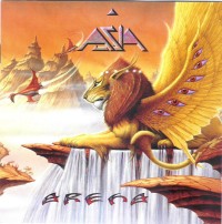
You used to provide the covers for progressive acts like Eloy, Asia, Barclay James Harvest, Rick Wakeman and also for melodic rockers as Wishbone Ash and Magnum. In the past years there were some older concerts released on DVD by Uriah Heep, Steve Hackett, Barclay James Harvest and Magnum. I’m referring to the classic rock series. All covers I know of are by yourself and Roger Dean. Who asked you to provide all these covers and who made the choices for these DVD-covers?
"I think what happened was that the initiator of these Classic Rock Legends DVD's - I believe his name was Carruthers - sent me an email. I came up with ten or twelve images and he chose which ones he would use and for which band. Other companies have taken second rights to some of my works for Nazareth and Hawkwind, by Secret Records."
Recently you published a new book called Alice in Wonderland. What’s the story behind this book?
"First of all I have to mention that some of the illustrations were done quite a long time ago for limited edition prints and the calendars for 1988, the great writer's calendar, and one for 1990. Some were done recently to make up the weight for the book. The way this came about was that Nigel Suckling, who worked on my three Anthology books, rang me up and told me he was doing some stuff for a company called Templar Publishing and that he mentioned my name to the art director there. Not too long after that I got a call from them. They had done books like Beowulf and The Snow Queen and they asked me if I were interested in an Alice In Wonderland book. It turned out that the reason why they thought of me, was I'd done an artwork called Treebeard, from Lord Of The Rings. This had been published in a charity book for the Woodland Trust a long time ago. At the launch of that book, with me present, the original was sold in the Chris Beetles Gallery and he asked me if I had any more of these works lying about and I replied: sureley I have! So I gave him some more artworks from Alice in Wonderland, used for the limited edition prints and that's when John Cleese came along and bought two originals! This event set me on a different avenue, because I had done the illustrations for the great writer's calendar for my own interest but now it became clear there were people out there showing interest in this line of work. So given the opportunity and following the advice of my wife Karin, who wanted me to do a whole story instead of all those fragmented things, I jumped at it!"
From several of your artworks there are high quality prints available. From which artworks and how can they be ordered?
Giclée prints are available from rodneymatthews.com store: Chase The Dragon, On A Storytellers Night, Princess Alice And The Broken Arrow, Immortal, The Battle, The Revenge, The Gate To The Wonderland, Old Man Willow, The Palace Of Hearts, Take Him Inside (from "The Wind In The Willows"), Ionawr and A View To Septo City. Also three lithographic limited editions: Encore At The End Of Time, Terrestrial Voyager and Trinity.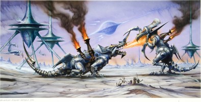
In what kind of projects are you involved at the moment?
"Usually there are commissions ongoing. Recently I finished one for John Cleese: an illustration from a classic British children's story The Wind In The Willows. Then I'm working on a book cover for Marco Palmer, called The Intergalactic Adventures Of Stanley And Livingstone. It's a cartoon thing which has been lying about for quite a while. I will provide a cover and some black and white drawings. Of course I'm busy with all those prints, there will be some mugs available too. My main goals will be to focus on animations and computer games."
This interview was conducted in April 2009, while Rodney's wife Karin was very ill. Shortly after our visit she sadly passed away and she will be greatly missed. The interview however has been updated to June 2010.
Links: www.rodneymatthews.com and www.en.wikipedia.org/wiki/Rodney_Matthews